ABOUT THERMOTEC
Thermotec by Spire is a specialist insulated conservatory roof replacement system, designed and installed by the team behind Spire Windows. Transforming a room that’s too hot in summer and too cold in winter into a space that’s genuinely usable all year round.
THE PROBLEM
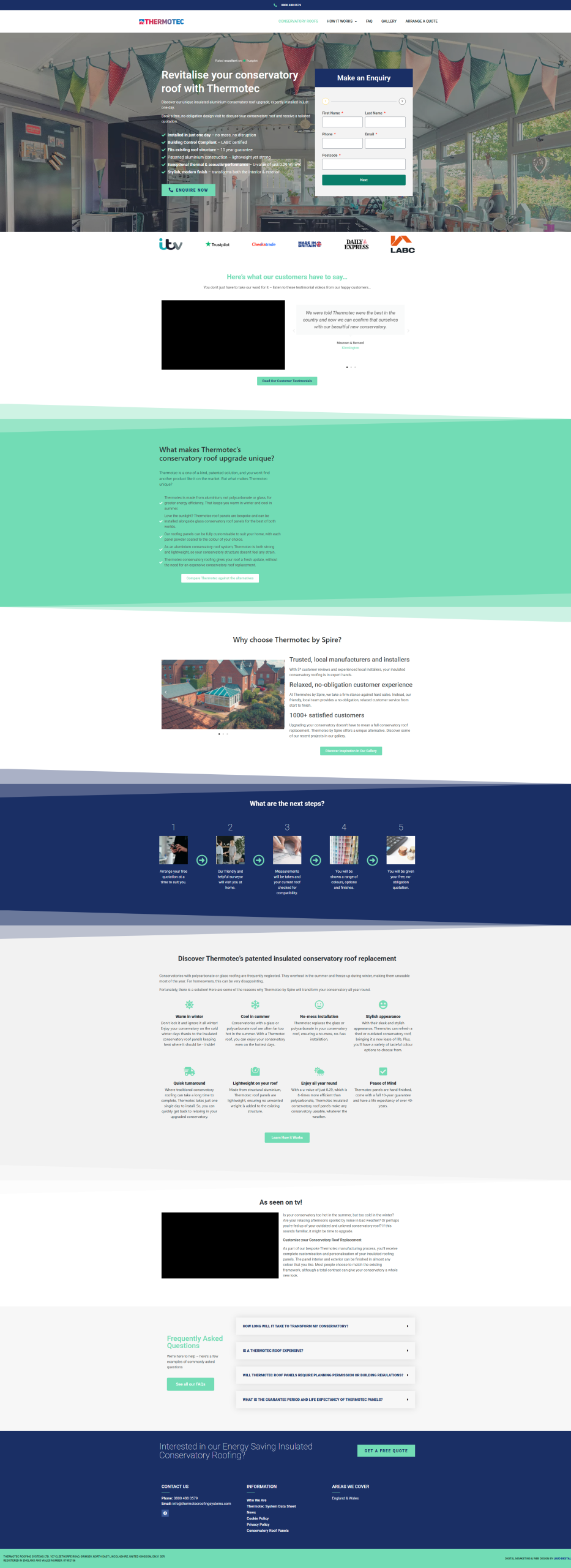
The old landing page wasn’t doing the product justice. Its one job was turning traffic into enquiries, and the design kept getting in the way.
It was cluttered and hard to scan. The slanted section breaks and teal-heavy colours made it feel dated and busy. The “what makes us unique” block was a wall of tiny text that nobody was ever going to read.
The hero was overloaded too. Six long benefit lines fighting for attention next to the form, so the main message got lost. The form itself (“Make an Enquiry”) felt cramped.
And the same benefits were repeated all over the page across three or four different sections, with no real hierarchy pulling the visitor towards an enquiry. There was also no gallery and no before-and-after. A big miss for a product that sells on the visible transformation.
THE SOLUTION
The goal was simple. Take a premium, high-trust product and give it a page that feels like it.
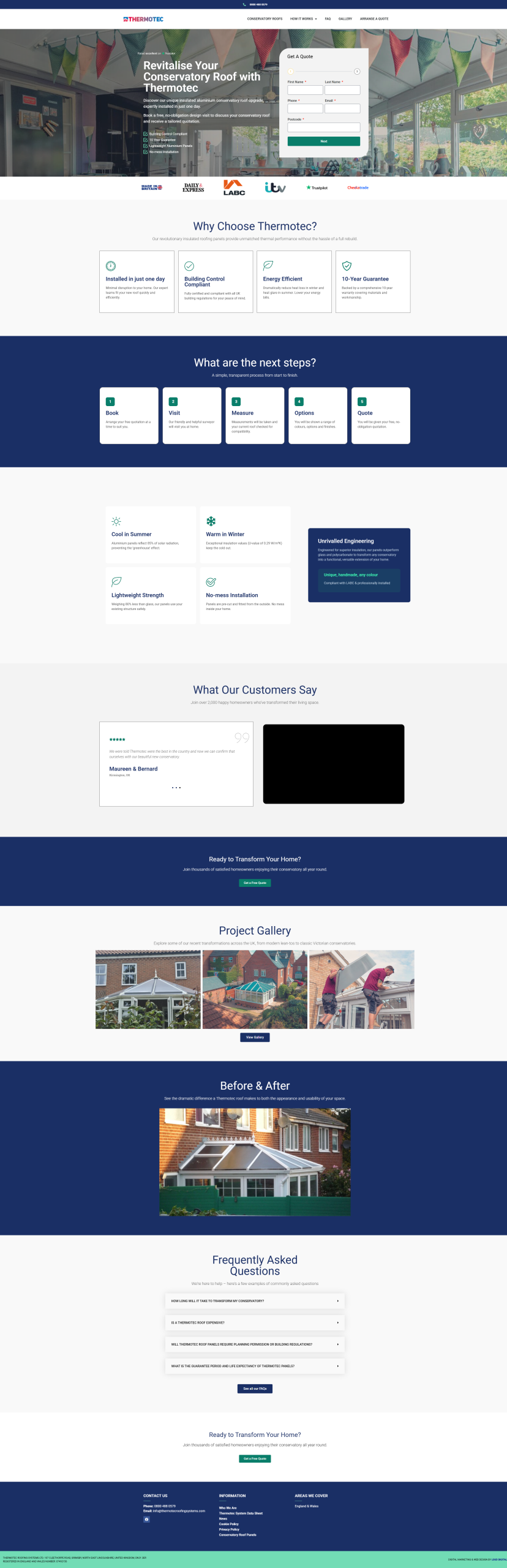
New colour palette
We dropped the teal-heavy, slanted look for navy, white and a green accent. Navy builds trust, the white space lets it breathe, and green is kept just for the CTAs so the eye always knows where to go next. The diagonal sections are gone, replaced with clean blocks.
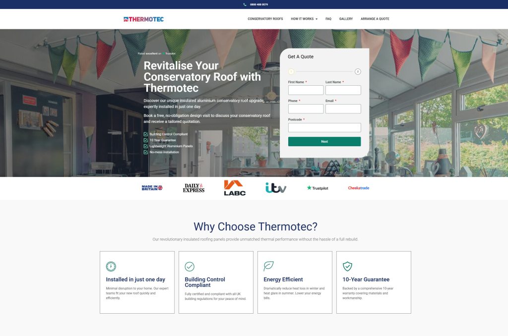
Stripped-back hero
We cut the hero down to four benefits that actually matter on first glance: Building Control Compliant, 10-Year Guarantee, Lightweight Aluminium Panels, No-mess Installation. Then we let the headline and image do the work. The form became a clean “Get A Quote” card, framed around what the customer wants (a price) rather than what we want (an enquiry).
Scannable benefits
The biggest issue was density. We turned the long paragraph-heavy sections into tight, icon-led cards. A “Why Choose Thermotec?” row up top, then a focused four-card grid: Cool in Summer, Warm in Winter, Lightweight Strength, No-mess Installation. One idea per card, so you get the value in seconds.
Cleaner conversion journey
We rebuilt the path to enquiry.
- Next Steps module: the image-heavy strip became five clean numbered cards (Book, Visit, Measure, Options, Quote), so the process feels simple and no-obligation.
- Repeated CTAs: we added “Get a Free Quote” prompts at natural points down the page, so nobody has to scroll back up to act.
- Unrivalled Engineering panel: instead of burying the technical credibility in body copy, it gets its own navy feature card.
Gallery and before/after
The old page had barely any real imagery of the work. We added a Project Gallery of recent jobs and a proper Before & After section. For this product the before-and-after is the single most persuasive thing on the page.
Social proof
We tidied the testimonials into a clean review card with video, and pulled the trust logos (ITV, Trustpilot, Checkatrade, Made in Britain, Daily Express, LABC) into a neat strip right under the hero, where they do the most good.
Consistent and mobile-first
The whole thing now runs on one consistent card and grid system instead of feeling patched together. That looks sharper on desktop and scales properly on mobile, which is where a lot of this traffic lands.
THE RESULTS
- Total page size was reduced from 8Mb to 1.9Mb.
- Initial page load time was dropped from 4.6 seconds to 1.5 seconds
- Conversion rate increased 34%