We recently worked with a client who had not changed their website design in over 10 years, it was barely mobile friendly and the product pages were a complete mess, the image below explains the situation much more clearly:

They were hesitant to change anything initially, as the product page above was still generating sales. After a few weeks of explaining the benefits of running an AB test in Google Optimize we were given the go ahead to design a more modern product page, following our guidelines set out in our how to design effective product pages post we got to work.
Looking at the image above you can see there’s lots of stuff going on, different font weights, colours & sizes which would confuse and overwhelm readers, the price was mentioned 3 times! The Add to Cart button didn’t stand out and was just hovering to the side of the page, not really nudging people towards adding the product to their cart. The product description is a massive wall of text that I’ve cut from the image above, but it’s over 1,000 words in a block.
They don’t provide a short and sweet description of the product either, it’s too technical and not worded in the form of benefits. It’s worded in the form of a features. This makes it a company logic headline, not a user logic headline.
We implemented a fully-formed value proposition, to make their product page pass the 5 second rule. This means your website must answer these three basic questions in 5 seconds:
-
Where am I?
-
What can I do here?
-
Why should I do it?
If your website fails the 5 second test, your bounce rate will be well above average and your conversion rate will suffer.
The purpose of a value proposition is to encapsulate your offer so that the website visitor does not need to think.
With that in mind we build the new product page so everything was clearly laid out without the new for flashy colours and special offers dominated the content.
We came up with a list of questions that a typical customer might have and included them on tabs, to keep them on the most important page outside the checkout stage (the product page!).
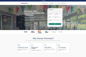
We then included reviews, installation and shipping & return tabs to assist with any possible objections that customers may have. This is what we ended up with:

As you can see this product page is a lot easier to digest, the add to cart button is clear, the benefits are well defined with a short description and bullet points, and users can use the tabs to access more information. Within 14 days of this test launching the new product page generated 400% more revenue when compared with the old page.
Remember, always be testing!